Introduction
What is design, at its core? In my own personal relationship to, and definition of design, it means making an experience engaging for the user. That could be making sure that a document is readable, that a poster is understandable, that a website is navigable. It really all boils down to access—inviting the user to engage further means that the design is easy to access—for everyone. How is it acceptable then, that so much of design is, techically speaking, inaccessible?
Accessible design goes beyond the aesthetics mentioned above. Not only should the document be readable by avoiding large chunks of plain text, it should also be accessible to users using assistive technology to engage such as a screen reader, or using a toggle to move through the document.
In case you needed more justification, here are some more reasons to invest (yes, invest!) in accessible design.
It’s the Law!
All public sector organizations as well as businesses and non-profits with 50+ employees are legally responsible to publish design that is accessible. Including their website and all documents listed on it. We’re talking WCAG 2.0 Level AA. Sorry, I didn’t mean to get all technical on you so soon, but this one is important to know! Most people are familiar by now with the Accessibility for Ontarians with Disabilities Act (AODA) but may not know about the Web Content Accessibility Guidelines (WCAG). This legislation requires organization’s web-based content to follow 4 principles:

Perceivable
Can any user perceive the content? This includes those who use screen readers, closed captioning, and other assistive technologies. This is where alternative text for images and colour contrast come into play.
Operable
Ensuring that anyone can operate and navigate through the content, even if they are using a keyboard or other assistive technology. Navigation should be crystal clear, use of proper design principles such as consistent text sizes and clear text hierarchy are essential.
Robust
Is the content compatible with alternative viewing modes? This includes a website being responsive to mobile, viewable on different browsers, and compatible with assistive software and devices.
Understandable
Is the content and purpose clear to the user? Content and navigation should be intuitive and predictable, avoid jargon-y language, and implement graphic design principles to avoid large chunks of text.
It’s Better For Everyone
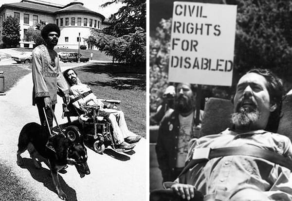
Have you heard of the Curb Cut Effect? Curb cuts, the dips in sidewalks at intersections and crosswalks, were first created to accomodate people using mobility devices, such as wheelchairs. But they weren’t just implemented with the invention of sidewalks, they were fought for by unapologetic, sometimes sledgehammer-wielding, disability rights activists. Championed by the Rolling Quads group at Berkeley in the 60s, including disability activist Ed Roberts, the group took to the streets, chopping down curbs and lugging around bags of concrete to create their own curb cuts, demanding action from the University.

Ed Roberts at Berkeley University
“Together, they insisted the city build curb cuts on every street corner in Berkeley. And their call to action sparked the world’s first widespread curb cuts program.”
Fought for and won by civil rights activists, curb cuts are now a defining feature of our cities, helping people push strollers, elderly cross the street, travellers carry luggage. Thus the Curb Cut Effect translates to: design features that are created for people with disabilities, but end up benefitting everyone.

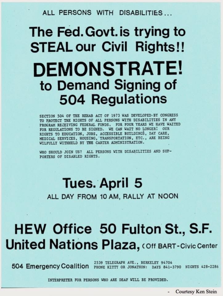
Protest flyer in support of Bill 504 “Americans with Disabilities Act“
The same can be said for many accessibility features. Creating alternative text for images on your website boosts search engine-optimization (SEO). Closed captioning on video is widely used on streaming services globally. Text hierarchy and good typesetting creates a more navigable and functional website.
Some people (designers included) say that accessibility features are a disservice to aesthetics. I argue that they are essential for functionality, and therefore define the aesthetic.
Missed Opportunities
In addition to, you know, just *the basic human rights*, making design accessible opens up a whole audience. In Ontario, approximately 2.6 million, or 1 in 4 people have a disability (Ontario.ca). That’s a lot of people that organizations could be welcoming in instead of, quite literally, creating barriers. Additionally, as Logan Stewart writes on the Whimble blog, “having people with disabilities on your team may just offer a unique perspective you never thought of before. Nobody knows what it's like to live with a disability more than somebody who has one.”
A whopping 90% of websites are inaccessible
That is an unthinkable and unacceptable number. We’re living in a digital age, how is it that almost all online content is inaccessible? Ed Roberts, Hale Zukas, and countless others fought for the physical accessibility features that are implemented worldwide today. They didn’t ask permission, they took matters into their own hands.
A part of the problem is that the internet is a global platform, and anyone can create a website (easier that ever, I might add). The way I see it, we need to hold the increasingly-popular ‘no code’ website builders accountable — every day another website is published with fancy pop-ups, complicated back-end code, and sometimes none of even the most basic accessibility features.
Enough thinking of accessibility as an afterthought. Access should be built in from the ground up, integrated into every aspect of design.
It’s on all of us to continue the work that the disability rights activists achieved in the 60s. Let’s figure out how to continue their work in the digital age. My accessible design journey is ongoing. I’m committed to this learning journey, follow along with me for part 2!
From my Desk
Accessible events with Whimble
Do you host events? Take them to the next level with Whimble’s free Accessible Event Guide!
I am super grateful to have designed this document for Whimble. It’s a truly collaborative, intentional guide, informed by community members sharing their own lived experience.
Thanks for keeping updated!
Until next time,


